

Jeanette Gaskill
For the News-Leader

Jeanette Gaskill
In my experience working with clients, I find them struggling as they try to find a pillow to match the exact color in their rug and so they miss out on a sale or a great item that will enhance their space, creating depth through a color scheme and their finished product does not have the impact they truly desire. Even when you design a white room, you are not using all the same color of white as that would look institutional and bland. You use various shades of white and creams to create a cozy Zen space. Here is a quick lesson in color rules from designers and experts to understand how to use different tones and pairings in your home.
Several questions I get asked are, Are there really color rules in interior design? There really is no such thing as a “correct” palette, but if you're less confident with color, there are a few things you should consider before introducing them into your space. After all, it's always best to be equipped with knowledge on how to pair different shades together, and how much of a color to use in any one room.
The answer is, when it comes to interior design, color rules teach you how not to create an explosion of hues that lead to a chaotic feel that mismatches between rooms. The rules guide you on how to choose shades, balance them and go for the best colors for your spaces.
Seven color rules interior designers swear by
It's important to say that color doesn't standalone in interior design. 'We generally look at color as another variable along with texture, material mix, and pattern that will create the overall feel of a home. I believe that sometimes you need color and sometimes a mix of materials, textures, and patterns to create the vision you are going for without the use of many colors. These all have an effect on how these color rules play out.
1 Consider the 60-30-10 rule
The 60-30-10 rule is a classic design staple to keep in mind – a great stepping stone to creating a scheme. Essentially, it means separating your palette with 60 percent as the main color, seen on sofas, coffee tables, rugs, or anything large and central to the room. 30 percent is the secondary color that takes over the soft furnishings like the curtains, bed linens, an accent chair, and so on. Finally, the 10 percent is meant to give balance to the colors used in any space, used on smaller elements like a lamp, cushions, artwork.
This is especially useful to those who want a lot of color in their home but aren't sure of how to balance them. Interestingly, if you prefer a monochromatic color scheme this rule can apply too. Your main, secondary, and accent colors, can be varying shades of the same hue (say black or grey), rather than three separate colors.
2. Choose a color mood
While the idea of having a colorful home seems tempting, zeroing in on a color scheme may perhaps feel like the hardest task. How do you begin? What color should you choose and why?
Before diving into choosing colors for your home, take stock of hues that you gravitate towards. Look to nature, art, clothes, and accessories for inspiration. Once you have a general color scheme, use fabric samples and paint decks to understand how the colors you like work together in a physical space. It's important to test colors in person because the amount of natural light in your space is a big factor in what works best.
Decide how you'd like your home to feel: blues and neutrals tend to be soothing, while reds and saturated colors can feel more dramatic. Establishing consistency and a flow between different rooms is also important. While each room can look and feel different, it's always a good idea to tie the overall spaces together with color. This can be accomplished by using the same trim color throughout the home or using a color on the walls in one room and using that same color in a rug in the next room.
Another good point to keep in mind as per “color theory” (In the visual arts, color theory is the body of practical guidance for color mixing and the visual effects of a specific color combination. Color terminology based on the color wheel and its geometry separates colors into primary color, secondary color, and tertiary color. - Wikipedia) is that in a predominantly hot climate, you might want to avoid or use fewer warm hues and cooler neutrals. If you live someplace that tends to be cloudy, cool, and rainy, then layering several warm hues in different shades can give your interior a cozy feeling.
3. Use the color wheel for color pairings
Pairing different furnishings or wall color combinations can feel daunting. Does red go with green? Would a blue wall go with a pink sofa? A great way to overcome this issue is by looking at the color wheel. Complementary colors are the ones that are on opposite sides of the wheel and provide high contrast and high-impact visuals. The ones that are side by side are analogous and need a little more care and attention, else the scheme can seem too overwhelming.
Opt for tonal hues of the same color, choose contrasting, complementary colors from the opposite sides of the color wheel or use colors that sit next to each other on the color wheel. Even if you opt for different pairing methods in different rooms, it will help you keep a sense of consistency and balance.
4. Create a throughline between rooms
One way to ensure that a color scheme flows from room to room is to limit yourself to hues in the same temperature family. So, you could consider all warm palettes of reds and oranges and yellows or a cool scheme of greys, greens, and blues. You could also go for one or two colors and then use variations of it, so if you're choosing a navy living room color scheme, then you could introduce grey-blue, a pure blue, and an indigo as you move from room to room.
When creating a color palette for your home, you want to use and blend the chosen colors sporadically in every room so that it hangs together in its entirety. The starting point could be anything with a variety of complex colors, say a painting, a fashion designer's season, a movie, a body of work that works together and has a variety of color to choose from. You then choose the principal color for each room and apply accents found within the palette throughout. When it comes to hues, this allows a home to work from the bottom corner to the top.
If you are choosing two colors, the simplest way is to keep to tones of the same basic shade, like a pale grey-green with a deeper olive. Another is to choose a soft and stronger color that has a similar underlying hue, for example, a warm taupe with soft terracotta, or the colder hues of a cool off-white with a deep turquoise.
5. Choose between a warm or cool color scheme
The temperature of color affects how it's perceived, and this is where cool and warm color schemes come into play. Essentially, the basic color wheel is split into warm and cool tones. The warm half comprises red through yellow-green, and the cool half runs from green through red-violet.
Warm colors tend to advance, which means they draw in space, often making an excessively large room feel smaller or more intimate. If in a room you want certain elements to feel closer and more drawn in, paint them in warmer colors. The warmest tone on the color wheel is red, and the last stop on the cool side of the wheel is violet-red.
Cool colors are known to create a calmer and smoother scheme. While warm colors connote more to heat or sunshine, cool colors remind you of water and sky. As opposed to warm tones, the cool ones recede, making a space appear larger. So, if you live in a small apartment, then perhaps choosing a cooler paint color might be in your best interest. Colors such as blue, green, and light purple usually signify cool tones.
When dealing with warm and cool colors, no rule says you should use only one and not the other. Feel free to use cozy, warm colors for the dominant scheme and add a few elements that incorporate cool colors. A little bit of balance and contrast will go a long way in your home's scheme.
Another important factor to consider is the effect light has on color. Lighter or cooler colors reflect more light than darker, warmer colors. If you want to brighten up a space, choose a lighter, subtler hue that has more white, cream, or beige in it. To tone down a room that gets a lot of light, consider colors that have browns, blacks, or reds in them.
6. Don't discount clashing colors
The basic color wheel can teach us a lot about the relationship between different hues. When you study it closely, you see that there are colors opposite each other, and similar tones side by side. Opposing colors are said to be complementary colors, and teach us how to use clashing colors that look effective and eye-catching. For instance, orange and blue are opposites, and using them will help create a striking interior.
An interesting variation to complementary tones is the split complement. Essentially, instead of simply taking two opposing hues, so for instance green and red, you veer to the right or left of the color wheel, and bring in a bit of close-by hues to the direct opposite, in this case, orange and purple. Green, orange, and purple are split complements.
Colors that sit next to one another on the color wheel are analogous hues. These are those instantly balanced hues because they tend to share similar tones. So, yellow, yellow-green, and green can make up an analogous color scheme. Usually, in analogous schemes, it's best to choose one dominating color, and pepper the rest in subtler ways.
7. What are color harmony rules?
Color harmony refers to certain aesthetically pleasing color combinations; essentially contrasts that look balanced and delightful. Within this, you could choose complementary colors, split-complementary tones, triads, analogous hues, and more, all that teach us how to use different hues together.
Of course, one important consideration to keep in mind is that while in theory, color combinations and principles may provide some guidance on how to create a palette, they don't always work in practical applications. This is because several external factors also contribute to how a color combo will look in a space. From lighting, fabrics, and size of space to others, a lot depends on how colors come together in a room.
These seven rules will help you achieve a space that not only will speak to you but also those around you. One of my favorite quotes that sums up the importance of color is this one from Georgia O’Keeffe, “I found I could say things with color and shapes that I couldn’t say any other way – things I had no words for.” Let color evoke the mood you want your space to feel like.
Jeanette Gaskill is the lead designer for Coastal Cottage of Amelia, where she has worked for the past six years. She loves being able to work hand-in-hand with her customers to design the spaces they dream of. Gaskill knows that interior design is very personal so she considers it an honor to be invited into her customer's homes. As part of the process, she takes time to get to know her customer's personality and tastes which is always reflected in the final result - she can make magic.
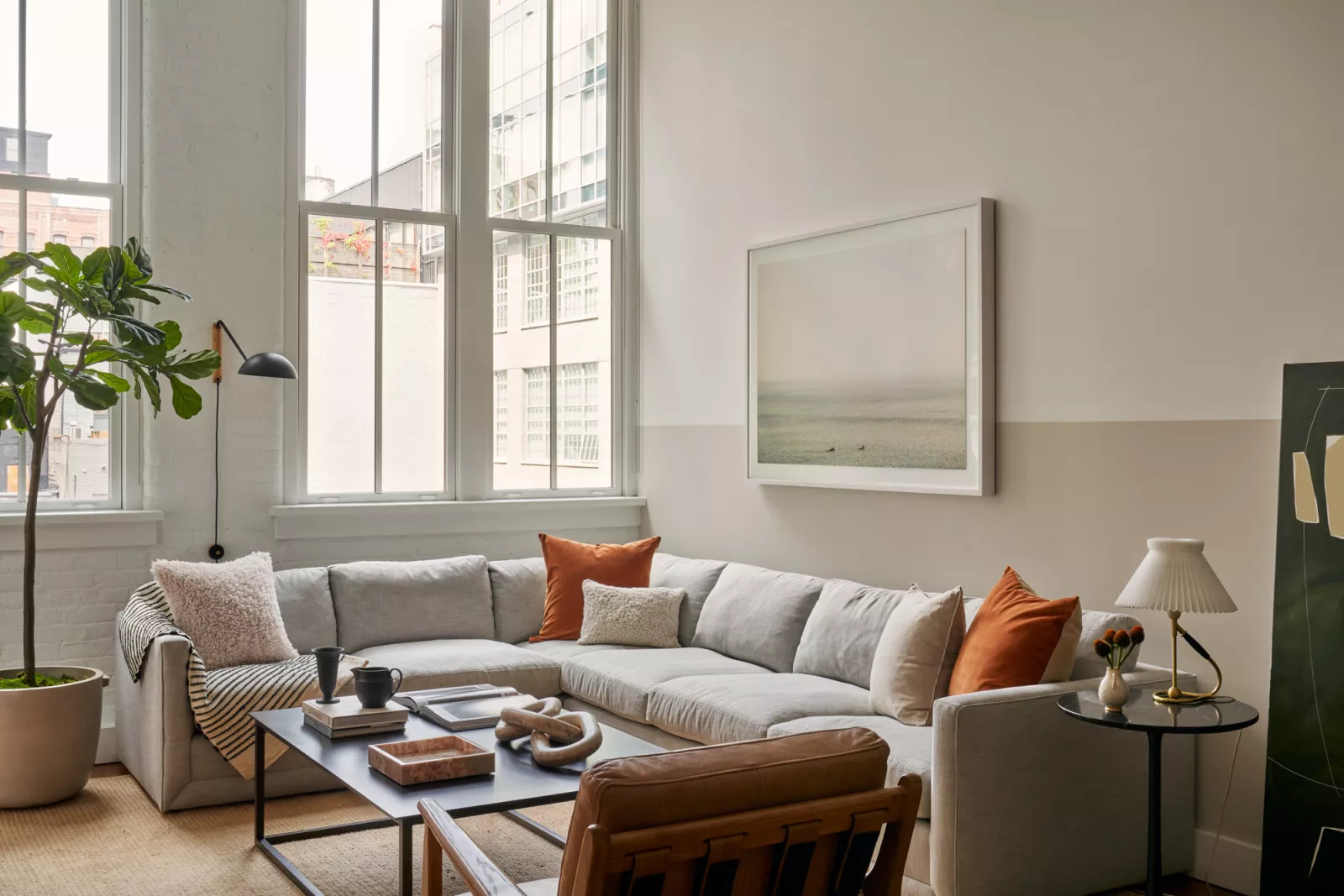
Color rules – these are the basics interior designers swear by for choosing a palette. Submitted photo
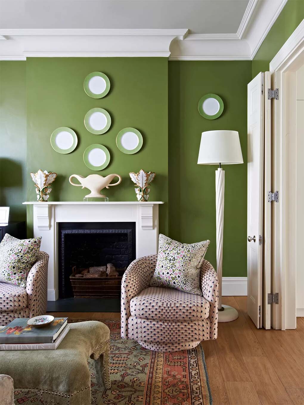
Color rules – these are the basics interior designers swear by for choosing a palette. Submitted photo

Color rules – these are the basics interior designers swear by for choosing a palette. Submitted photo
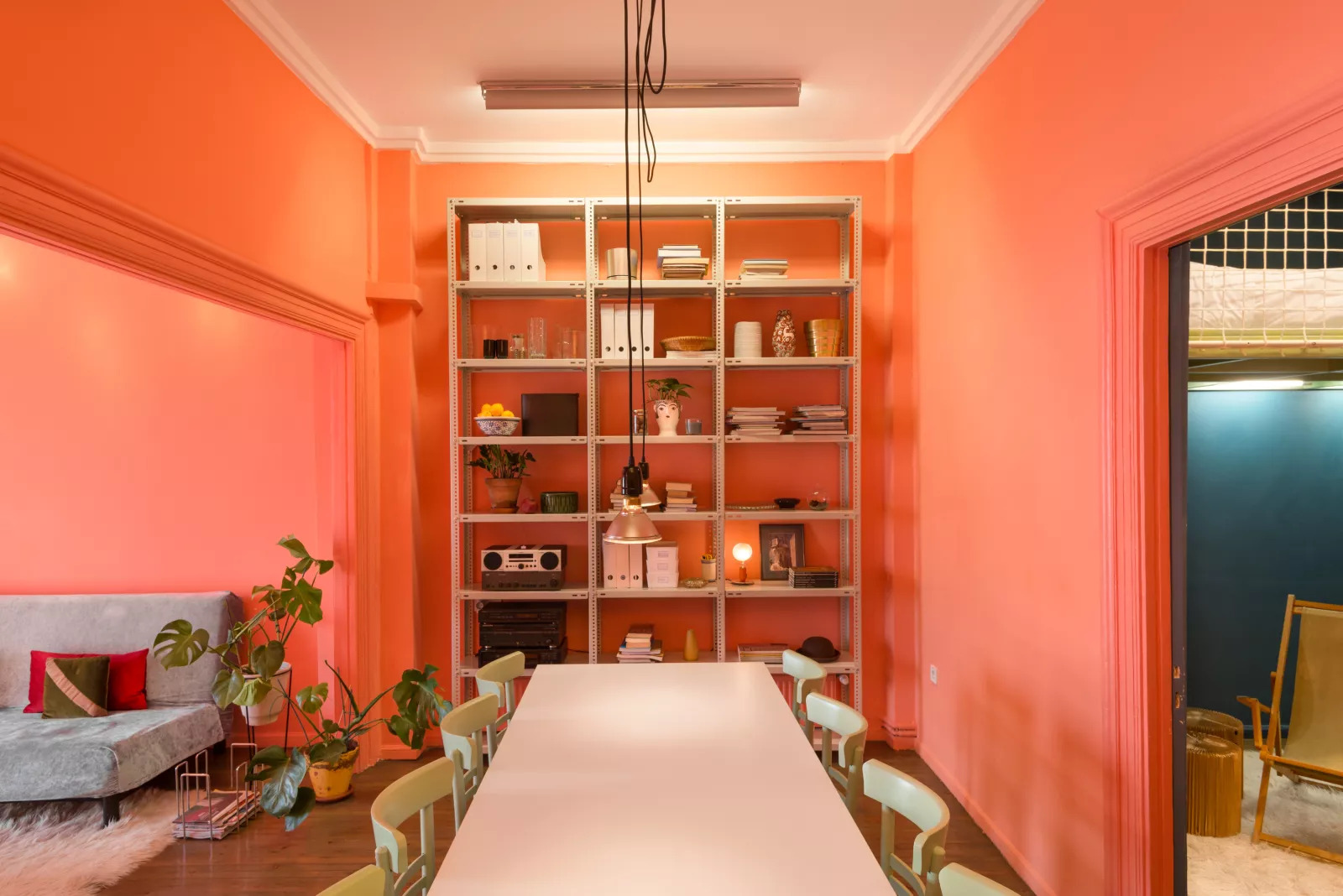
Color rules – these are the basics interior designers swear by for choosing a palette. Submitted photo